Vehicle wraps are a fun, creative, and effective way to get your company seen!
Using your logo to brand any kind of vehicle makes your business stand out in the crowd, and uses the morning commute to connect with new audiences. Your choice of vehicle and design is crucial to creating a good impression on your customers, and as such, your logo needs to be recognisable and clearly visible.
Here we have collected several of the most effective vehicle wraps for marketing and described why they are impactful!
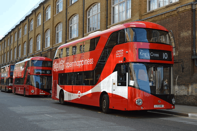
1. The Coca Cola Bus
This is a striking advertisement for several reasons.
First and most importantly, the high contrast between the red background and the white logo and text emphasises the Coca Cola logo and slogan. The logo and slogan are neatly fit in the rectangular space between the windows which provides further emphasis on the branding. Similarly, the white curve that is often featured on the Coca Cola logo runs parallel to the S-shaped window and provides a counterpoint to the straight lines of the bus itself.
There is not too much text, which is effective because the majority of the public recognise the Coca Cola brand as a drink. However, this may not be as effective for a lesser-known brand. The font of ‘Coca Cola’ is in their signature handwritten font, but the slogan is in a light, simple sans serif font, which makes it easy to read, and highlights the simplicity and memorability of the slogan.
The association of the red Coca Cola with the quintessentially English red ‘London Bus’ also helps to market Coca Cola to the British public by associating it with British things despite the brand itself being American. This is a great example of targeting your audience and knowing what will catch their attention.
Our Rating: 5/5
2. The BRS Offroad
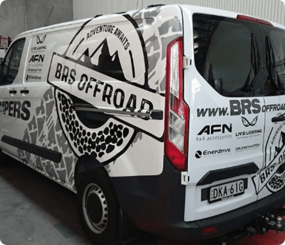
This camper company know exactly what they are doing with vehicle design! The logo is large and impactful, but the simplicity of the black and white logo against the grey tire print stops it from being too ‘in your face’. The visual of the mountains is a good way to summarise the off-road experience, and the circle with the textured bottom is suggestive of a wheel.
The BRS logo is also repeated on the back, along with the webpage so that customers can be easily directed. The business name BRS is in large and bold lettering, with the rest of the URL in italics. This helps to further emphasise the brand name. The letting on all sides is in capitals and a striking, easily legible font.
The amount of logos is perhaps a little over the top, but otherwise, this is an impactful design which is effective at putting across a visual message via branding.
Our Rating: 4/5
3. The Advan Neova
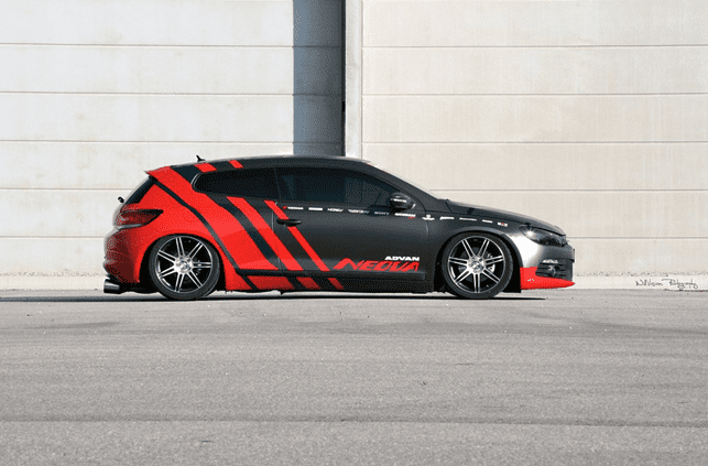
This vehicle wrap for car model Yokohama Advan Neova is strikingly classic.
The text follows the lines of the car, including the sponsors’ logos which emphasise the window of the front doors. The white and red stand out strongly against the black, and the red is also picked up along the front of the car.
The sponsors’ logos are small as to not distract from the overall impression of the car. The look of this car is deliberately made to look sleek and sporty, using a slick metallic grey and black to suggest an almost ‘futuristic’ style, contrasted with the red ‘sports stripes’ which gives the impression that the car will be fast and agile.
If we had any criticism, it would simply be that this wrap does not give enough information about the brand. That being said, it is a slick, well put-together, and memorable design.
Our Rating: 4/5
4. The Kansas Chiefs Wrap
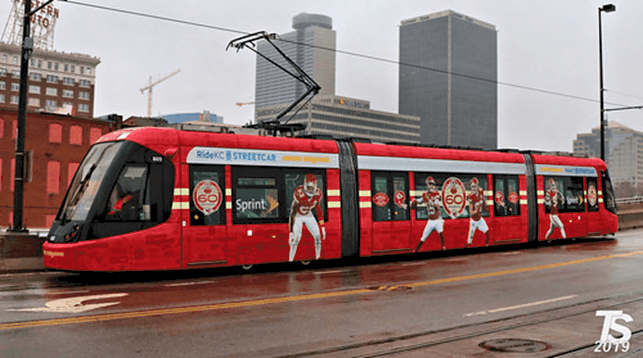
Vehicle Wraps aren’t just for cars, as this Kansas Chiefs train advertisement shows! This is immediately eye-catching because of the sportsmen, who look like they are playing a game from a distance!
The colours of the train tie in with the uniforms, while the white of the shorts provides contrast, and the running stances of the players make it visually engaging and immediately show what the advertisement represents.
The advertisement also draws attention to the 60 years that Kansas Chiefs have played for. If we were to redesign this wrap, we would change one of these images to the logo of Kansas Chiefs instead, to emphasise the team name and to give more information about the team. However, this is still a very effective and engaging promotion.
Rating: 3/5
5. The Lime Van
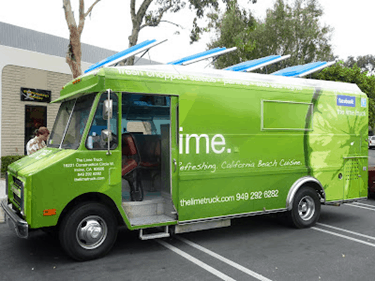
This one is almost perfect!
The white text has a nice contrast between minimalist sans Serif on the top and bottom, with the company description in a casual, handwritten font. This helps to make the company appear approachable.
The image of the Lime fits in with the company name, but without being over the top. The green background ties in with the image of the lime, and is simple and minimalist, which means that the business has been able to expand the amount of text by including social media, their address, URL and business registration number, and a description of the kind of food that they serve.
The minimalist appearance of the wrap with the chunky van makes the company seem up-to-date, and effortlessly stylish.
The only problem with this design is that the beginnings of the words are cut off when the door is opened.
Rating: 3/5