If you’re looking to promote your business, your commercial vehicle is an easy and convenient way to get your company’s name and branding out there. Simply taking the van out for some deliveries will become an advertising opportunity as your vehicle promotes your business to all the drivers and pedestrians you pass along the way!
But what are some of the factors that go into designing an effective and attention-grabbing company vehicle wrap? Our guide takes a look.
Create An Image
If your business had a face, what would it look like?
Maybe it seems like a strange question, but when creating an image for your brand, you have to know what ‘personality’ your business would have.
Would it be known as reliable? Professional? Or creative, perhaps?
If you choose a simple, minimalistic, and effective design, you’ll suggest that your business is streamlined, organised, and efficient – which is highly effective for sectors that require a professional or reliable image that communicates a sense of trust. Therefore, this type of design is a useful starting point for ‘practical’ businesses – like builders, plumbers, medical vehicles, and lawyers etc.
Alternatively, bigger, bolder designs with eye-catching patterns, fonts, and messaging will be especially effective if you are promoting a creative business, or if you are trying to attract a younger audience. This approach may be preferable for businesses such as designers, hairdressers, dog groomers, fashion outlets, and more.
Keep Consistent Colours
Chances are, if you’re choosing a vehicle wrap, you already have your logo and branding designed.
This means that to keep a flowing, consistent marketing image you should use the same colours, fonts, and motifs on your vehicle that you have used in your logo – right down to the exact shade. For example, if you are a gardener and your logo is a green apple on a white background, you may choose to use green text on a white background, or white text on a green background.
As a rule, you should avoid using red text on a blue background, or vice versa, because this is often hard to read. So if your logo is in red and blue, consider adding in white or black elements to make the text stand out more – for example, you could have red and blue text on a white background.
Feature Fascinating Fonts
You should primarily use the same font for your vehicle wrap that is in your logo, but you may wish to ‘mix it up’ with a second, contrasting font to provide more visual interest in the following cases:
- When you have a large quantity of text
- When there are certain key phrases that you want to emphasise e.g. all items are now half price!
- When you want to separate certain key details (like your contact information, for example) from the main body of text
You can also use contrasting colours to further emphasise the font changes.
Pick The Perfect Layout
When considering the layout of your wrap, bear in mind the design of the vehicle and what would best complement it.
Is the vehicle square, or does it have a more rounded, ‘organic’ shape? Where do the windows sit? Are there any unusual or distinguishing features that would be good to highlight?
Express Your Message
When designing your vehicle wrap, take a moment to consider the message that you want to put across. Do you want to emphasise the high quality of your work? Or perhaps show your creative side?
It’s important to communicate what type of business you are and why your target audience should choose you – all while staying concise!
Example 1:
(https://www.signsnow.com/vehicle-wraps)
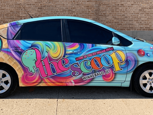
Take this ice-cream business car for example.
This design is very effective because the rounded ‘swirl’ shape complements the curved roof of the car, which makes the logo – positioned on a diagonal straight line – stand out more.
The contrasting textures between the ‘waffle’, the swirls, and the blue ‘wood’ pattern behind the main logo provide visual interest. Meanwhile, the logo is strong and graphic, which enables it to stand up well against the busy background. This vehicle is eye-catching, striking, and memorable, proving very effective despite the limited contact information.
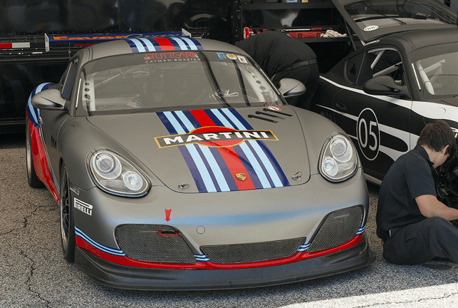
Example 2:

This is a great example of a racing car wrap!
Firstly, the plain silver colour helps the Martini brand stand out, making it impactful and preventing too much visual overload. The racing stripes add a ‘sporty’ quality to the car, and the red and navy colours tie in with the Martini logo.
Meanwhile, the stripe under the front grille is red too, which emphasises how low the car is to the ground; this again firmly establishes the vehicle’s status as a professional sports car.
Overall, this is an exciting design that fits into the racing industry very well.
Example 3:
(https://www.signlinkgraphics.co.uk/products/car-wraps-graphics/)
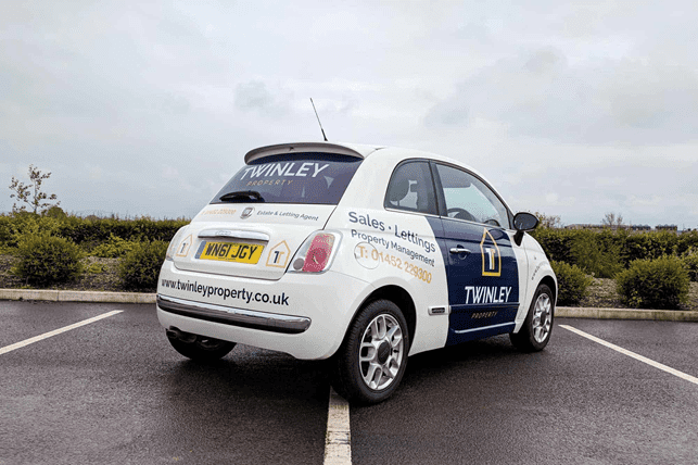
Here’s a useful illustration of how effective even a simple car wrap can be.
This wrap features little more than three colours and a single font, and it uses the natural shape of the car to highlight the text. The design achieves this through the positioning of the URL on the bumper, and by placing the main logo on the side of the car while allowing plenty of space for all the text.
This kind of design is highly effective for brands that want to use a lot of text in their advertising and in their vehicle wrap solutions.